

Webmaster should become familiar with the following list of the top ten potential barriers to watch for! It is by no means a complete list, but represents the most common accessibility problems.
1. Images without a Text Description
Images without a text description will be inaccessible to those who are blind. Text descriptions are typically added using the “alt” attribute with the HTML img element. Note that the length of alt text should be no longer than 125 characters. Screen readers will typically stop reading the text at that point. If a longer description is needed, there are a variety of ways to describe the image further, either in the surrounding text, in a figure caption, or using the ARIA attribute aria-described by. In each case alt would still be used to provide a brief description and refer to the longer description elsewhere.
Technical: Using the alt attribute to refer to a longer description <img src="abelincoln.jpg" alt="Abraham Lincoln at his desk, see description below" / >

Images of text will also be inaccessible to blind users, and also potentially inaccessible to people with low vision, who may attempt to magnify the image resulting in the text often degrading to the point that it becomes unreadable. People with reading disabilities who use reading software may also have trouble with images of text as they cannot be read by the software.
There are occasions where images are strictly decorative or contain no useful information. In such cases the alt attribute should still be used, but its value left empty (i.e., alt=””). This forces a screen reader to ignore the image. If an empty alt attribute is not included, screen readers will read the file name of the image, which can interfere with comprehension of the surrounding information, or leave a screen reader user wondering if they are missing something in the image.
Key Point: Be sure all images are adequately described using text.
2. Functional Elements That Only Work with a Mouse
People who are blind are not likely to use a mouse when operating a computer (though there are some that do). Most rely exclusively on a keyboard to navigate through page features. Any element that only operates with a mouse will not be accessible to blind users. People with limited mobility may rely on a keyboard. People with low vision may also rely on keyboard access. “Power users” also tend to use a keyboard to navigate more than average users. Usability will be affected for all of these people when keyboard access is missing.
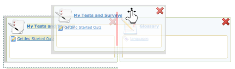
Figure: Drag and Drop elements should be controlled by keyboard, or an equivalent alternate provided
Key Point: Be sure all functional elements operate with both a mouse and a keyboard.
3. Text That Looks Like a Heading, But Is Not
People who are blind and using a screen reader to navigate through web content will have a feature in the screen reader to list the headings on a page, so they can potentially jump to any one of those headings and begin reading. The list of headings also provides a good overview of the content on the page, making it easier to find specific information. When “heading-like” presentation of text is used (e.g., making the text bold and large), the structure provided by proper headings will be missing, requiring these users to navigate through the entire page to discover its content. This greatly increases the effort needed to move through web content. Always be sure proper HTML headings are used to represent page sections instead of styled text.
Technical: Using proper headings:
Accessible:
<h1>The Last Chapter</h1>
Inaccessible:
<p style=”font-size:22pt; font-weight:bold;”>The Last Chapter</p>
Likewise, headings should not be used to style large bold text, where the text is not a heading or section title. This creates confusion when listening to a heading list with a screen reader.
Key Point: Be sure all heading or section titles within web content are created using proper HTML heading markup (h1, h2, etc.).
4. Links That Do Not Describe the Destination or Function
Like headings, screen readers can list all of the links on a page to gather a summary of the resources that lead from it. If the link list is made up of meaningless phrases like “click here” or “this link” or “more”, little or no useful information is provided to the screen reader user. For most users, meaningless links like this make content more difficult to use. If you are able to see, imagine yourself coming across these links and having to read through the surrounding text to figure out where the link leads, or having to click the link to discover its destination.
Key Point: Be sure all links describe the destination of the link, or its function if it is used to open a window or pop up a dialog box, for instance.
5. Lists That Look Like Lists, But Are Not
Screen readers will recognize a properly-formatted list using HTML ordered or unordered list markup (OL or UL), announcing the list and the number of list items, and indicating one’s position in the list while navigating through it. This information helps with memory and comprehension. Without the proper list markup, more effort is often required to comprehend a list of items.
Key Point: If a collection of items looks like a list, be sure HTML list markup is used to format it as a list. If the order of the items is important, an ordered list should be used; otherwise, use an unordered list.
6. Missing “Within-Page” Navigation
You have already been introduced to two potential ways to navigate within pages, using headings and links. There are a variety of other ways to move around within pages, such as providing “bypass links,” often created to allow assistive technology users to skip over repetitive elements like navigation menus, and jump to an anchor further down the page. ARIA landmarks can also be used for this purpose, assigning specific roles to elements (e.g., banner, navigation, main) that can be listed by screen readers and directly jumped to (e.g., <div role=”main”>…</div>). Without ways to navigate within a page, screen reader users may be required to move through the content in sequence from beginning to end to find the information they are looking for, which requires a lot of unnecessary effort.
Key Point: Be sure there are ways to navigate around within web content, using headings, bypass links or landmarks, etc.
7. Poor Visibility, Contrast, or Use of Colour On Its Own
Providing good contrast between text and the background on which it appears is important for a variety of reasons. For those with low vision, or for older readers, text may become unreadable if it does not contrast well with the background. Using an image as a background can also be problematic, particularly when content resizes and text moves over various shades of dark and light, making parts of the text difficult to read.
Key Point: Be sure there is good contrast between text and background colour.
The visibility of the cursor’s focus indicator is also important when navigating using a keyboard. Someone with low vision who may have the screen magnified several times may find it easier to navigate with a keyboard than a mouse. If they are unable to see where the keyboard focus is located, keyboard navigation becomes difficult or unusable.
Key Point: Be sure the cursor’s focus location is easily visible when navigating by keyboard.
As an example, you may come across a feature that uses a green start button and a red stop button. Some colour blind users or those with low vision may not be able to tell the buttons apart. Adding the words “Start” to the green button, and “Stop” to the red button provides the extra indicator in addition to colour.
Key Point: When colour is used to represent meaning, be sure there is some other indicator provided to express that meaning.